top of page


Blue Ridge Parkway
INFORMATION ARCHITECTURE · UX DESIGN · WEB DESIGN · NONPROFIT
A national conservation nonprofit with a sprawling, hard-to-navigate website and a mission worth showing up for. The site needed to catch up.
The Situation
The Blue Ridge Parkway Foundation protects and enhances one of America's most iconic scenic byways — 469 miles of Appalachian ridgeline connecting Shenandoah to Great Smoky Mountains. Built on an outdated and difficult to use platform, their website had accumulated years of additions without a clear organizational logic. Important pages were buried. Donation pathways were hard to find. The visual design no longer reflected the beauty of the place or the credibility of the organization.
Supporters were landing on the site with real intent — to learn, to give, to get involved — and leaving without a clear path forward.


Outdated & incomplete navigation made it hard for supporters to understand the Foundation’s impact
Visual design no longer reflected the beauty of the Parkway or the professionalism of the organization
Donation and engagement pathways were buried, leading to missed opportunities to convert interest into support
The Insight
With the discovery of hidden content, we knew a new information architecture was essential to the success of our rebuild project. As was identifying key users and developing thorough branching journey maps. Then we identified the real problem with the site.
The primary issue with the old website was not just that people could not find their way around it — the site was too difficult to maintain as the organization grew. Our priority had to be building a platform that made sense on both ends so it was simple to use for contributors of all abilities, from volunteers to directors.

The Work
For this project, I partnered with an agency whose content strategy and SEO work dovetailed directly into the IA work — a clean division of labor that let each discipline operate at full depth.
With our key insight in hand, and a wealth of organizational research provided by the foundation, I began my work on their user experience: who visits this site, what they're trying to do, and how to build a structure that gets them there without friction. Most importantly, how can this be built so it can't be broken?
PRIMARY AUDIENCE
Parkway visitors & tourists
The broadest audience — people who visit, love, or are curious about the Parkway. Four distinct groups with different motivations and entry points.
SECONDARY AUDIENCE
Gateway Communities
Towns and neighborhoods just off the Parkway with a stake in tourism and visitor flow — economic partners as much as constituents.
Families & vacationers
Planning trips, looking for activities, lodging, and accessible entry points along the route.
Local day-trippers
Residents of nearby communities using the Parkway for recreation, seasonal outings, and casual drives.
Historians & heritage travelers
Drawn to the Parkway's cultural significance, natural history, and Appalachian heritage.
Music lovers
Visitors drawn to the Blue Ridge Music Center and Appalachian folk and bluegrass traditions along the route.
DONOR AUDIENCE
Institutional Donors
Corporate sponsors and philanthropic partners making significant gifts. Motivated by mission alignment, visibility, and demonstrated impact.
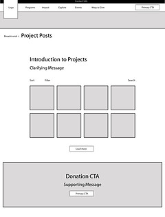
Then, I completed a full content inventory and reorganization — mapping everything the site needed to provide and building a new hierarchy around actual visitor needs rather than internal organizational logic. From there, user flows identified the primary paths (explore the Parkway, learn about programs, donate, get involved) and wireframes locked in the content structure before any visual decisions were made.
USER FLOW MAPPING

WIREFRAMES

The visual design brought it all together — photography, color, and typography calibrated to create an emotional connection to the landscape while directing attention toward the Foundation's key conversion points. Mobile optimization and accessibility were built in throughout, not retrofitted after.


The Result
The Foundation now has a site that reflects the scale and credibility of the work they do. Navigation is intuitive. Donation pathways are visible. Programs are findable. Visitor stories give the site an ongoing community layer that brings people back. And most importantly, it's built and organized with contributors in mind on a platform thats designed to grow.
For a conservation nonprofit, trust is the conversion. The redesign was built to earn it at every step.
"We love our new website! It's beautiful, easy to navigate, and helps us engage with our parkway visitors."
— RITA L., BLUE RIDGE PARKWAY

bottom of page